
A page without a call to action button (CTA) is like a driver without a map. A CTA button aims to direct your user on a clear path within your site helping to achieve the goals of your site.
A CTA encourages the user to perform an action before leaving the page. Ideally, you should have one on every page. In some instances, such as a Task Focussed Landing (TFL) page, there may be more than one CTA because of the template design.
Our CMS has a specific CTA button style that sets the button apart from regular hyperlinks. The CTA button should be the main action you want your user to take on the page e.g. if it is an event page, your CTA might be ‘Register now’.
Why create meaningful CTA buttons?
Strong, meaningful and actionable CTA buttons can create a sense of urgency. This leads to stronger conversion rates (a ‘conversion’ is when someone takes your desired action on the page).
CTA button best practice
To ensure your CTAs are up to scratch, ensure they:
- have a strong, clear and relevant call to action
- are benefit related
- use an active voice
- are easily identifiable (contrasts with surrounding content using our specific CTA button style).
Some examples of CTAs include:
- Register your interest
- Book a library tour
- Join our mailing list
- Subscribe to our newsletter
- Discover our Sydney Campus
- Download our Strategic Plan [PDF 2.5MB]
- Plan your day
- View Open Day schedule
- Meet our team
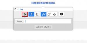
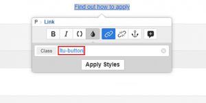
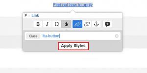
How to create a CTA button
Follow these steps to get started adding a CTA button to your page:
- select text for a hyperlink
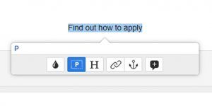
- create hyperlink using chain icon
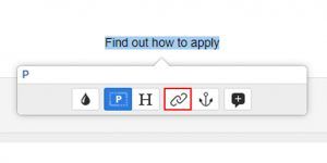
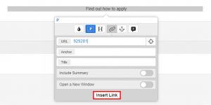
- insert asset ID
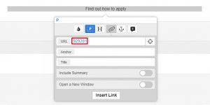
- apply changes
- select tear drop icon
- insert text “ltu-button”
- apply change
Have questions about your web editing?
Remember, we’re always here to help! To reach out, please: