You may have noticed that new designs and components are selectively rolling out across our website. These components and layouts are part of La Trobe’s Design System and they help deliver consistent web experiences. Some of the benefits are that users can now expect a similar experience on the website as well as on our other digital interfaces. To learn more about design systems and their role see what is a design system.
What’s new
La Trobe’s Design System which is named “Wedgetail” (in honour of our campus dwelling Wedge-tailed eagles) features components with new designs, styling and functionality. The Design System helps define user interactions and provides guidelines to developers and content producers on how to use them.
The components have been designed and developed with new configurations to extend their functionality and existing components have been adapted to meet web accessibility and branding requirements. The components are modular which helps designs, adapt and scale.
New components
Let’s dive into some key design system (or DS for short) components…
Warning- These components won’t work on your older style site as they use a different page layout. Adding these components will break your page.
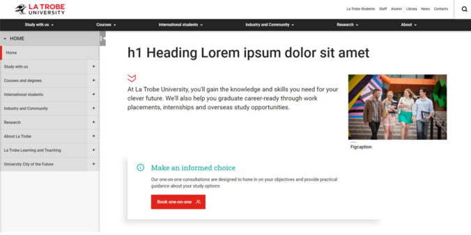
DS Page intro
The page intro is a short sentence which introduces the point of the page and provides context to your user. A user should grasp the essence of the page when reading the introductory 1-2 sentences.
Design: The intro text style is larger than standard paragraph text and features a chevron icon. This module also includes a featured image functionality which allows you to set an optional hero or featured image next to the page’s introductory sentence. Settings for this functionality were previously on the details and metadata tabs.
Note- please use featured images sparingly and ensure the image adds value to the page.
Example: Page intro component
DS Content card set/ Content boxes
The DS card set displays a group of individual cars which provides a brief description of a task or action with an optional call to action (CTA) link. Content cards can include an optional image, but this is not mandatory. A maximum of four cards can display in a row, with a maximum of eight content cards recommended per page.
This module is recommended for landing pages and high-value navigation pages. Please use images sparingly.
Example: Card set component
DS Button group
Buttons help define user actions. Older style buttons were implemented with a class (ltu-button) but this isn’t required in the Design System. The button group can display up to three buttons depending on the users’ tasks. When using a group of two buttons, alternative styling can be used to identify the primary button and action.
Example: Button group component
DS Callout
Use the callout component to deliver a timely message or highlight an important update. We recommend this module if you want to alert your users of important information.
Example: Callout component
DS Accordion
Previously accordions added a group of 10 accordion items to your page. The new accordion module consists of only one item. In the Design System, you add additional accordion components for each accordion item. The good news is you can now rearrange the order of your accordion items easier.
Example: Accordion component
What’s different
We’ve also added a few enhancements to these well-known components:
Design system migration
Selected microsites are currently being migrated into the design system based on strategic priorities.
If you want your site to adopt the Design System, we’ve developed a process where web editors based in Colleges / Schools / Research Centres/ Divisions will need to self-manage the migration of their website (if approved) into the Design System. The Website Operations Team will provide guidance and signoff at key stages of the process.
As your site’s existing settings are not compatible with the design system, you can’t use the new design components in your current webpage layouts.
Please see the Migrating your site into La Trobe’s Design System (DS) page for more information.
Training and documentation
We are developing resources and self-paced training videos for web editors on using the Design System. Watch the CMS Editors Teams space and the Web Editor blog for more information.
Have questions about your web editing?
Remember, we’re always here to help! To reach out, please:
0 Comments
1 Pingback